Software / Reporting

Reporting

Recovery Metrics & Churn Analytics

Most retention tools report one number: revenue recovered. MaxLTV reports the whole funnel, from the failed charge to the subscriber who left, built for subscription revenue rather than pulled from a generic payment report.

01 · Payment recovery

Recovery rate, split by what actually recovered it

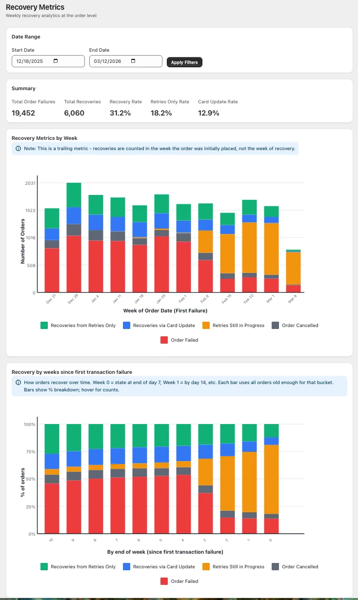
Recovered orders divided by failed orders that finished retrying, bucketed by the week the order first failed. The total splits into two lines: recoveries from retries alone, and recoveries that needed a customer to update their card. That split is what tells you whether to fix your retry logic or your messaging, and a blended rate never will.

  • In-flight retries are excluded: Failures still being retried are left out until their sequence finishes, so a recent week is never inflated. They show as a shaded ceiling instead, and your subscription platform counts them the same way.
  • Recovery by weeks since the failure: How much of each week's failures came back by week one, two and four, and what ended cancelled.
  • Revenue and LTV both reported: Alongside total failures, total recoveries, retries-only rate and card-update rate, because a recovered order and a saved subscriber are not the same thing.
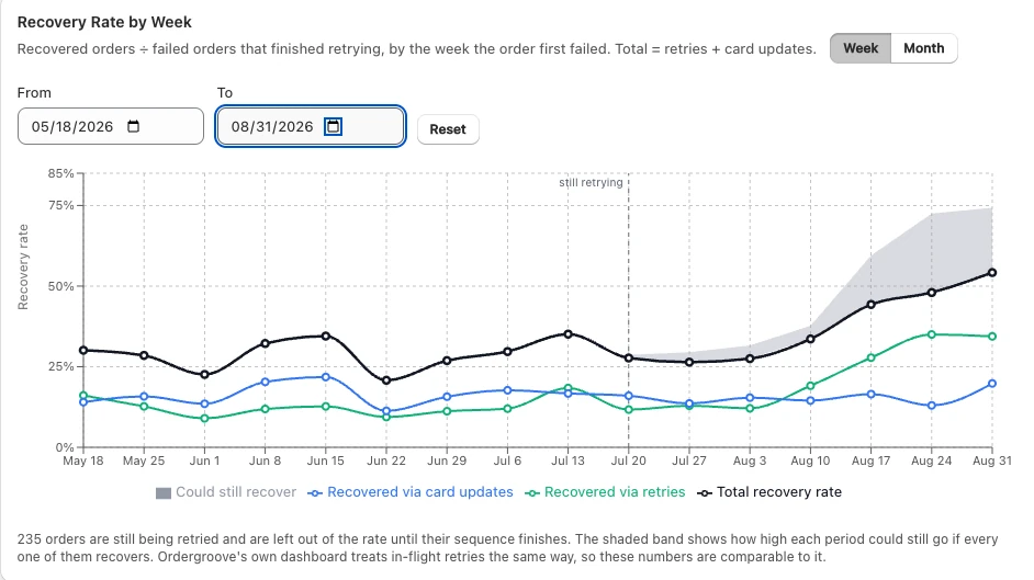
Recovery Rate by Week chart showing the total recovery rate split into recoveries via retries and recoveries via card updates, with a shaded band for failures still being retried
Total recovery rate, and the two lines underneath it. Failures still being retried sit outside the rate as a shaded ceiling.
Recovery Metrics dashboard showing total order failures, total recoveries, recovery rate, retries-only rate and card-update rate, with weekly and cohort breakdowns
The same data at order level: summary rates, weekly outcomes, and recovery by weeks since the first failure.

02 · Dunning performance

Whether the message moved the number, or the retry did

Emails sent, opens, clicks and conversions, reported next to recovery rate rather than in a separate tool. When recovery dips, these say where to look: retry timing, copy, or the card-update flow. Every report runs over any date range and breaks down by time period, segment and product, so a change you made in March is measured against February instead of disappearing into an annual average.

03 · On-site campaigns

What your on-site campaigns actually did

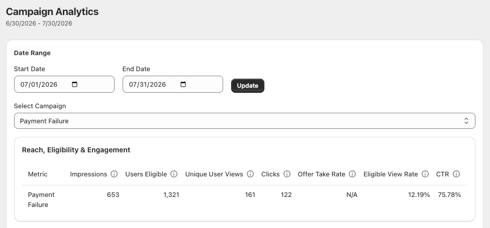
Every banner and notification reports its own funnel: how many subscribers were eligible, how many actually saw it, how many clicked, and what share of the eligible audience it reached at all.

  • Eligible view rate: The share of subscribers who qualified and actually saw it. A banner reaching one in eight eligible subscribers is a targeting problem, not a copy problem.
  • Click-through and take rate: What people did once they saw it, kept separate from how many saw it.
  • Impressions against unique users: Repeat impressions reported apart from unique viewers.
Campaign Analytics table for a Payment Failure campaign showing impressions, users eligible, unique user views, clicks, eligible view rate and click-through rate
One row per campaign: who was eligible, how many actually saw it, and what they did next.

04 · Retention by cohort

How far each cohort actually gets

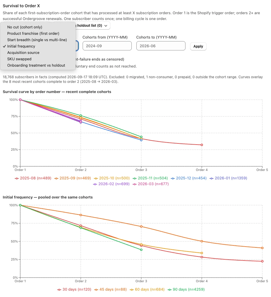
Survival to order X is the share of each first-order cohort that has processed at least X subscription orders. Order 1 is the Shopify trigger order; orders 2 and beyond are successful renewals. One subscriber counts once and one billing cycle is one order, so the curve reads as retention rather than revenue.

Most brands lose the largest single share of a cohort between the first and second order, long before any tactic aimed at month six applies.

  • Cut by the things you control: Initial frequency, first product, single versus multi-line starts, acquisition source, SKU swaps, and onboarding treatment against a holdout.
  • Voluntary and involuntary separated: A subscriber whose card failed is censored rather than counted as a decision to leave.
  • Only complete cohorts are compared: So a young cohort never looks better than an old one purely because it has not had time to churn yet.
Survival to Order X chart showing the share of each monthly cohort that reached order 2, 3 and 4, with a menu of cut dimensions including initial frequency, acquisition source and onboarding holdout
Each cohort's survival curve, and the same cohorts pooled by initial frequency underneath.

05 · Churn analytics

Why and when subscribers leave

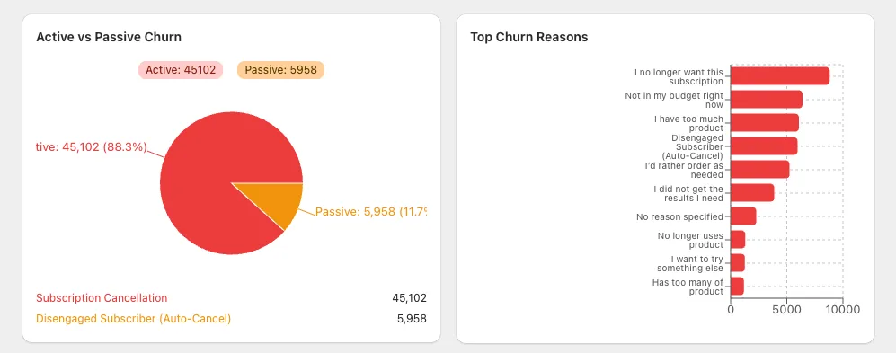
Churn split into active and passive, so a cancelled subscription and a dead card are never the same event, with cancel reasons grouped by the survey code your platform records rather than free-text labels that drift. Alongside it, a revenue-at-risk view plots every subscriber by lifetime value against churn risk, so the high-value high-risk corner is a list you can work rather than a statistic. See churn prevention for how the scoring works.

Churn analytics showing the split between active and passive churn and a ranked bar chart of top churn reasons
Active against passive churn, and the reasons subscribers give when they cancel.

Frequently asked questions

How is recovery rate calculated?

Recovered orders divided by failed orders that finished retrying, bucketed by the week the order first failed. The total is the sum of two lines reported separately: recoveries from retries alone, and recoveries that needed a customer to update their card.

What happens to failures that are still being retried?

They are left out of the rate until their retry sequence finishes, so a recent week is never inflated by attempts that have not resolved. The chart shows them as a separate shaded band: the ceiling that period would reach if every in-flight retry succeeded.

Can I see whether my dunning messages are working?

Yes. Emails sent, opens, clicks and conversions are reported alongside recovery rate, so when recovery moves you can tell whether the retry timing changed or the message did.

What is survival to order X?

The share of each first-subscription-order cohort that has processed at least X subscription orders. Order 1 is the Shopify trigger order and orders 2 and beyond are successful renewals. One subscriber counts once and one billing cycle is one order.

Can I slice the reports?

Every report runs over any date range and breaks down by time period, segment and product, so you can compare before and after a change rather than looking at one blended number.

Can I export the underlying data?

Yes. Every number resolves to the orders and subscribers behind it, on one definition applied the same way every period, so finance can check the figure rather than take it on trust.

Ready to see your numbers?

The free churn audit runs these reports on your data first, so you see the split between retries and card updates, and where each cohort falls off, before you decide anything.

Background reading: how to calculate churn rate correctly and recovery rate and natural variance. Compare: vs FlyCode, vs ChurnBuster.